Here are twelve neutrals that color experts and designers rank as their top
"fail-safe" picks.
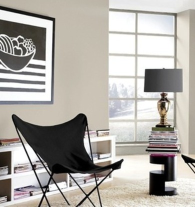
Amazing Gray (Sherwin-Williams SW7044)
Cinderblock (Ralph Lauren UL222)
For a warm, medium dark neutral I love Cinderblock. It just makes everything look rich and sophisticated. Very restful and pleasing to the eye. I just finished a Victorian reading room where I used it on the walls, trim, and ceiling as a home office and my client loves it.
—Myke Reilly, Designer and Co-Founder of The Happy Collective in San Francisco
Chelsea Gray (Benjamin Moore HC168
When people think about neutrals, they often think light and they don’t have to. This is a darker color that's still soft. It’s great with lots of linens, antiques, and vintage-style furnishings or it’s rich behind a contemporary white sectional.
—Sharon Grech, Color Expert for Benjamin Moore
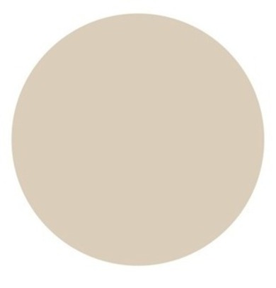
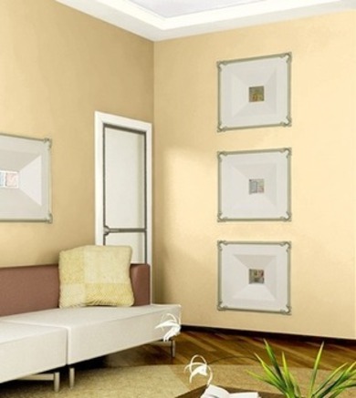
Manchester Tan (Benjamin Moore HC168)
This is a very warm neutral that is almost like an off-white. It’s not gray or cold, and it’s not a boring beige. It's nice with dark and mid-tone woods and works well with cooler colors like blues or with reds, yellows, and greens.
—Sharon Grech, Color Expert for Benjamin Moore
Restrained Gold (Sherwin-Williams SW6129)
This warm and inviting color not only looks good with painted white trim but also stained trims like oaks, plus it maintains its hue well in daylight or artificial light. It also looks great in just about every room and pairs well with a wide range of colors, from reds and oranges to blues, greens, or purples.
Safari Vest (Behr UL190-17)
Safari Vest makes a wonderful background color, because so many other colors harmonize with it. Cream trim and black accents create a classic modern scheme, or pair it with accents in burgundy, forest, or navy blue for a more traditional look.
— Erika Woelfel, Director of Color for Behr
.jpg&container=blogger&gadget=a&rewriteMime=image%2F*)
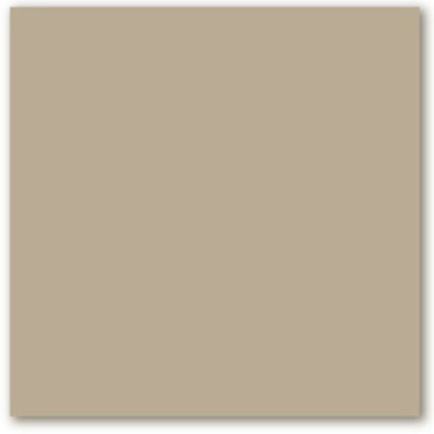
Toasted Wheat (Pratt and Lambert 7-26)
This has been one of our top colors for many years. It is a warm, nature-based tan that is extremely versatile. It has a certain amount of depth so that it will have a presence, but it is neutral enough that it won’t steal the show.
—Peggy Van Allen, Color and Design Specialist for Pratt & Lambert
I repainted my bedroom this color, which is a medium gray with just a hint of green. It’s not too cool and not too warm. My plan is to use it with other grays, a charcoal gray upholstered headboard, and dusty plum and chartreuse.
—Jackie Jordan, Director of Color Marketing for Sherwin-Williams

—Jackie Jordan, Director of Color Marketing for Sherwin-Williams
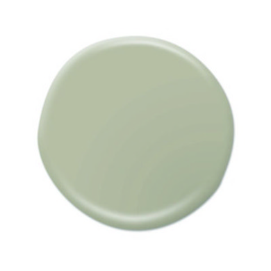
Sage Morsel (Valspar 5005-1C)
I believe more in timeless colors than fail-safe colors like this gray green with its sophisticated gray undertone. You can find this color in your garden, paintings, and vintage photos, but the lightness of the gray green makes it perfect for today’s home.
—Sue Kim, Color Trend and Forecast Specialist for Valspar
Cinderblock (Ralph Lauren UL222)
For a warm, medium dark neutral I love Cinderblock. It just makes everything look rich and sophisticated. Very restful and pleasing to the eye. I just finished a Victorian reading room where I used it on the walls, trim, and ceiling as a home office and my client loves it.
—Myke Reilly, Designer and Co-Founder of The Happy Collective in San Francisco
Chelsea Gray (Benjamin Moore HC168
When people think about neutrals, they often think light and they don’t have to. This is a darker color that's still soft. It’s great with lots of linens, antiques, and vintage-style furnishings or it’s rich behind a contemporary white sectional.
—Sharon Grech, Color Expert for Benjamin Moore
Manchester Tan (Benjamin Moore HC168)
This is a very warm neutral that is almost like an off-white. It’s not gray or cold, and it’s not a boring beige. It's nice with dark and mid-tone woods and works well with cooler colors like blues or with reds, yellows, and greens.
—Sharon Grech, Color Expert for Benjamin Moore
Restrained Gold (Sherwin-Williams SW6129)
This warm and inviting color not only looks good with painted white trim but also stained trims like oaks, plus it maintains its hue well in daylight or artificial light. It also looks great in just about every room and pairs well with a wide range of colors, from reds and oranges to blues, greens, or purples.
—Karen Mills, Owner of Interiors by Design in Kansas City, Missouri
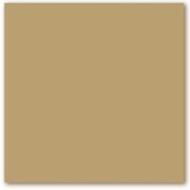
Warm Caramel (Glidden GLN01)
I think this is simply the most comfortable and delicious full-bodied neutral. It works wonderfully with both traditional and contemporary design styles and is perfect used alone or paired with another color. It is one of our top sellers from coast to coast.
—Barbara Richardson, Director of Color Marketing for Glidden
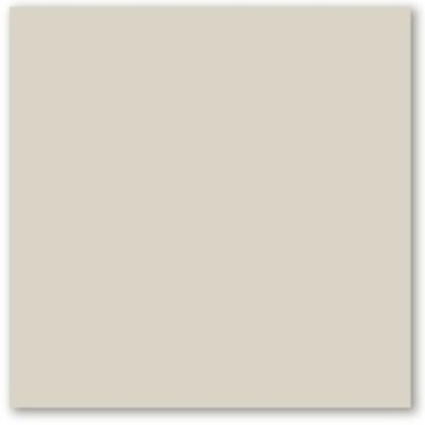
Smooth Stone (Glidden GLN36)
Smooth Stone is the perfect neutral, if you are looking for a color that has subtle character and one that is truly neutral without the influence of red or yellow undertones. It works beautifully with other accent colors, too.
—Barbara Richardson, Director of Color Marketing for Glidden

Star of the Garden (Kelly-Moore KM4004-2)
This is my favorite fail-safe hue. It is a neutral that has it all—not too light or too dark, too warm or too cool. It’s the perfect complement to all of today’s most fashionable colors. It’s popular for exteriors, too.
—Mary Lawlor, Manager of Color Marketing at Kelly-Moore Paints

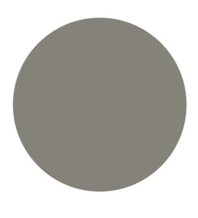
Ever Classic (Pratt and Lambert 32-34)
This is a perfect gray for walls or trim. It’s a mid-tone, neither too cool nor too warm. While all grays are trending strong right now, this is a gray that is a classic and will never go out of style. This color will lend a sense of luxury and refinement to any room in the house.
—Peggy Van Allen, Color and Design Specialist for Pratt & Lambert
Warm Caramel (Glidden GLN01)
I think this is simply the most comfortable and delicious full-bodied neutral. It works wonderfully with both traditional and contemporary design styles and is perfect used alone or paired with another color. It is one of our top sellers from coast to coast.
—Barbara Richardson, Director of Color Marketing for Glidden
Smooth Stone (Glidden GLN36)
Smooth Stone is the perfect neutral, if you are looking for a color that has subtle character and one that is truly neutral without the influence of red or yellow undertones. It works beautifully with other accent colors, too.
—Barbara Richardson, Director of Color Marketing for Glidden
Star of the Garden (Kelly-Moore KM4004-2)
This is my favorite fail-safe hue. It is a neutral that has it all—not too light or too dark, too warm or too cool. It’s the perfect complement to all of today’s most fashionable colors. It’s popular for exteriors, too.
—Mary Lawlor, Manager of Color Marketing at Kelly-Moore Paints

Ever Classic (Pratt and Lambert 32-34)
This is a perfect gray for walls or trim. It’s a mid-tone, neither too cool nor too warm. While all grays are trending strong right now, this is a gray that is a classic and will never go out of style. This color will lend a sense of luxury and refinement to any room in the house.
—Peggy Van Allen, Color and Design Specialist for Pratt & Lambert
Safari Vest (Behr UL190-17)
Safari Vest makes a wonderful background color, because so many other colors harmonize with it. Cream trim and black accents create a classic modern scheme, or pair it with accents in burgundy, forest, or navy blue for a more traditional look.
— Erika Woelfel, Director of Color for Behr
.jpg)
Toasted Wheat (Pratt and Lambert 7-26)
This has been one of our top colors for many years. It is a warm, nature-based tan that is extremely versatile. It has a certain amount of depth so that it will have a presence, but it is neutral enough that it won’t steal the show.
—Peggy Van Allen, Color and Design Specialist for Pratt & Lambert